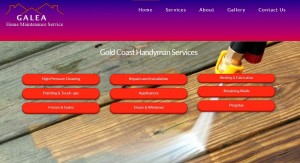
Local Gold Coast handyman Peter Galea had a bad run with website design and support lately. His hosts and designers disappeared overnight and took his website with them. He was desperate to get his site live again and Pogo were enlisted to help.
The Brief For Our Handyman Website
Pogo were given a mock-up of the site in a Publisher document and one week to make it happen. We were also given license to take the design and run with it. We chose to change the design for one that would better represent Galea’s handyman services and help convert his visitors to client. Despite the short lead time we wanted to bring to him a site that told his story and presented more opportunities to engage his visitors.
Our design borrows from several of the latest trends for web design. We’ve removed much of the text from the front page that was presented to us (because people don’t tend to read large blocks of text) and attempted to present the information in a more interesting way. We’ve made the information available in bite sized chunks. There’s also a strong emphasis on telling Galea’s story as we scroll down the screen. As people scroll down they should get an impression of what Galea Home Maintenance do and who they are. This should be recognizable to even the laziest visitor. We have multiple points for visitors to embark off further into the site and finally at the bottom a strong call to action (eg “Get A Handyan Quote” and “Contact Us” button).
Design Points For Our Handyman Website
You’ll notice that our handyman website is full-width and responsive. If you’re not familiar with responsive web design it’s just short-hand for a site that scales to different sized browsers, including tablets and phones. This site will look great and work great on any format.
For years web designers have been trying to figure out how to accommodate the varying sizes of screens. For years websites were designed into little boxes about 900 pixels wide. This width was a guestimate of the most likely screen size. We’ve moved on and have learned how to accommodate varying screen sizes while using more of the available width in large screens. Our handyman website uses the full width for a more attractive visual experience. It also scales down to phones beautifully.
We used several effects to provide interest to the visitor, such as parallax effects and fade ins. Though not necessary to the design they help create interest and a feeling that the site is alive and responding to the visitors input as opposed to a static unchanging display. It’s just another way webdesign can work hard to capture and convert visitors into customers.
We have not slides on this website. The slider fad has reached its zenith and is now over-used. Creative use of sliders is and will remain an important part of website design but it’s becoming and unnecessary cliché, something that is used regardless of whether it is appropriate. We had no place on this site for one and so didn’t use one. What we’ve used instead is scrolling design. This is partly responding to tablet and smart phone users. Desktop users scroll nowadays too, most of them without even thinking because it’s second nature. The information that might have been made available by making visitors sit through a slider can now be accessed on demand by scrolling down the screen.


