In the world of web design and search engine optimisation (SEO), site speed isn’t just a technical nicety—it’s a fundamental requirement. For businesses operating on the Gold Coast and beyond, the speed at which your page loads directly dictates how many customers you keep, how well you rank, and ultimately, how much revenue you generate.
Google has made it clear: speed is not negotiable. Yet, as developers, we constantly balance the urge to create rich, visually stunning websites against the hard reality of data transfer limits. This article explores the vital importance of speed, outlines the rare scenarios where sacrificing speed is an acceptable strategic compromise.
For optimal local SEO and user retention, your local business website should load in under two seconds, especially on mobile. While Google considers under 2.5 seconds for Largest Contentful Paint (LCP) as good, local businesses should aim for even faster times to stay competitive.
Best Version Media
The Irrefutable Case for Speed: SEO, UX, and the Mobile Imperative
Speed is the silent contract between a user and a website: the user gives you a few seconds of their attention, and you deliver the content. Failing to deliver quickly has immediate, measurable consequences. I know of one website where an increase in load times of their home page cost them 3,400 visit a month.
The Search Engine Optimisation (SEO) Impact
Google officially made page speed a ranking signal for mobile search back in 2018, formalising its importance with the introduction of Core Web Vitals (CWVs) in 2021. CWVs are a set of metrics designed to measure real-world user experience and are now a critical factor in how a page is assessed for ranking.
These metrics focus on three main areas:
Loading (LCP – Largest Contentful Paint):
How long it takes for the largest visual element to load. This must be fast to assure the user that the page is useful.
Interactivity (FID – First Input Delay):
How long it takes for the page to respond to the first user action (like clicking a button). This measures responsiveness.
Visual Stability (CLS – Cumulative Layout Shift):
Measures unexpected layout shifts.
The User Experience (UX) and Conversion Impact
Bounce Rate:
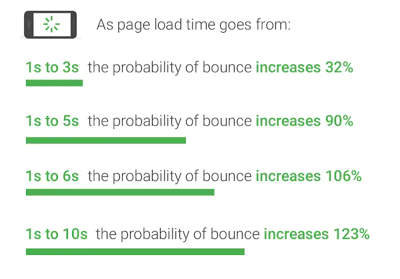
Pages that take three seconds to load see a 32% higher bounce rate compared to pages that load in one second.
Mobile Users:
For users browsing on mobile networks (which is the majority of the market today), speed is even more critical, as network latency is less predictable than on desktop. A slow mobile site feels broken.
Revenue:
Amazon famously found that every 100 milliseconds of latency cost them 1% in sales.
In short, a fast website is not about being technically elegant; it’s about making money by keeping visitors engaged and moving them toward a conversion (a quote, a call, or a purchase).
The Strategic Compromise: When is Slow Okay?
Given the evidence, why would any experienced web developer or business owner intentionally create a slow page? The answer lies in the Strategic Compromise.
Sacrificing speed is acceptable only if the benefit of the added content irrefutably outweighs the penalty incurred by the load time. It must be a calculated risk, and the team must understand precisely why the trade-off is being made.
The Acceptable Trade-Off
The primary reason to sacrifice speed is to deliver content that is unavoidably heavy but highly valuable to the user experience or brand proposition.
High-Definition Product Photography:
A luxury goods retailer needs to show high-resolution, uncompressed images of jewellery or fine art, as the quality of the image is intrinsically linked to the perceived quality of the product and drives conversions.
For Example: andclay.co

We worked with Cinnamon Garret to deliver her website andclay.co. As an artist, it was clear that we would want to open with a high-impact image. I would argue that while this is definitely necessary, at 1.4Mb her page is tiny compared to the 10mb or more seen on some websites. For Cinnamon, any trade off in page load speed was worth it.
Essential Above-the-Fold Video:
An optimized video at the top of the page can instantly demonstrate how a complex product works.
I’ve (over) used above-the-fold video in the past. What I tend to do now, if the client will allow it, is to load the video via user click. That way I can lazy load it, like at Gold Coast Caravan Sales. It’s also, by definition not part of the FID.
Complex Interactive Tools:
A financial institution includes a massive, calculation-heavy loan calculator at the top of the page, which is the primary reason the user visited the site.
The Fundamental Rule of Sacrifice: Prioritise the Fold
If you must include heavy assets, you must follow the cardinal rule of content delivery: Never block the loading of critical above-the-fold content with non-essential assets.
This means employing techniques like:
Lazy Loading:
Only loading images, videos, or complex scripts when the user scrolls them into the viewport.
Asynchronous Loading:
Loading non-critical CSS or JavaScript in the background so it doesn't interrupt the initial render of the page.
Content Prioritisation:
Ensuring all critical text, buttons, and the main image (the LCP element) load in under 2.5 seconds, even if the rest of the page takes longer.
Mistake 1: Heavy Content Above the Fold
What's Average Load Size For A Web Page?

I asked Google Gemini and this was his/her/they/its answer:
The average website page size has steadily increased over the years. Based on recent data (around 2022-2024), the typical average is generally in the range of 2 MB to 3 MB.
Here are some key points to consider:
General Average: Many sources indicate the average page size is around 2.0 MB to 2.5 MB for desktop sites and slightly less for mobile sites.
Historical Growth: The average page size has grown significantly, from around 1.6 MB in 2017 to over 2 MB today.
Composition: The largest part of a webpage’s size is usually images, followed by JavaScript, CSS, and fonts.
Optimal Size: For optimal performance and faster loading times, many experts suggest aiming for a page size of under 1.5 MB to ensure a good user experience, especially on mobile devices or slower connections.
Outliers: Very large sites with a lot of unoptimized media can easily exceed 5 MB or even 10 MB per page.
Mistake 2: The Low-Value Slider Trap
Do you have a slider high up on your page? Often the content within this early-loading element is not primary search content. It is a set of navigational shortcuts.
Our experience with analytics tools like GA4 (Google Analytics 4) and MS Clarity consistently shows that content placed in sliders and carousels suffers from notoriously low engagement. The click-through rate (CTR) on these individual links (states, types, brands) is often less than 1%.
Simply using sliders to display as much content as possible above-the-fold on your homepage may not be the best approach, both not only in terms of performance, but user experience and overall effectiveness too.
GT Metrix
The Right Way Forward: Optimisation and Prioritisation
This case study is a cautionary tale of misaligned priorities. If we were to embrace the philosophy of “informed speed sacrifice,” the page could be massively improved while retaining its rich aesthetic.
1. Efficient Image Formats (The SVG Solution)
The heavy images used for navigation should be converted to highly efficient, vector-based graphics.
SVG (Scalable Vector Graphics):
A vector file format (like the one right here) is one mathematically defined. For simple shapes, icons, and flags, an SVG file size is often less than 10 kilobytes (KB)—a mere fraction of the megabyte-sized JPEGs being used. This one is only 2.9kb.
2. Prioritise Based on User Intent
The most crucial content on a classifieds site is the Search Bar. This should be the single largest, most dominant, and fastest-loading element on the page.
All the secondary, low-click navigational elements (the state/brand sliders) should be moved further down the page, below the main search results or recent listings. This allows the essential content (search functionality) to load instantly, providing a successful LCP and FID score, while the heavy, secondary content is lazy-loaded as the user scrolls.
3. Eliminate Architectural Barriers
Ditch the Sliders and Tabs:
Replace the tabbed slider structure with a simple, static grid of SVG icons or small, well-optimised JPEG thumbnails. Users can quickly scan the entire range of options without clicking multiple times.
Deferred Script Execution:
The scripts required to run the carousel and tab functionality must be deferred until after the main content is loaded, ensuring they do not become an anchor to your poor FID score.
For Example: goldcoastpestinspector.com.au

I’ve been optimising Gold Coast Pest Inspector recently with a focus on speed. By eliminating the fancy stuff from the above the fold area, we’ve been enjoying double-digit growth in recent months. We also get to focus on the most important thing a visitor should see, that 5-star rating.
Conclusion: Speed Is Your Gold Standard
For Gold Coast businesses competing in a crowded digital space, speed is not a feature—it is the platform for every other feature.
Adding heavy, low-value content in critical areas of the page is not a strategic compromise; it is an unforced error that actively pushes users away and damages SEO performance.
My reading of this is that the user experience (UX) should always come first. Our users are the reason we build websites after all.
At Pogo, we operate on the philosophy that every millisecond of load time is a unit of your customer’s attention that must be respected. Whether you are building a new site or auditing an existing one, the time to ask the hard questions about your site’s architecture is now:
Is this feature worth the extra second of load time?
Can this heavy asset be lazy-loaded below the fold?
Am I using the most efficient file format possible?
Don’t let preventable technical debt sink your online presence. If you’re ready to speed up your site, improve your Core Web Vitals, and ensure your strategic content is prioritised correctly, contact Pogo for a comprehensive Website Performance and SEO Audit. We’ll help you win the race to the top of the search results, one carefully optimised kilobyte at a time.